Phew, getting past the more human side of life and design; I would like to start to enjoy the finer sides of blogging about packaging once again.
I recently moved to the Dallas area and started a job as a waitress at a new restaurant. This place is absolutely wonderful. It's based upon simple dining-things you always go to on a menu: burgers, salads, catfish, steak, etc. However, the recipes all have wonderful twists combined with beautiful artistry. DELISH! Although the meals can talk for themselves, and the atmosphere of being placed inside a historic Victorian house, the menus are enough for me to hesitate.
Talking to my other co-workers, I realize that some people not only eat trash, but they couldn't say they would be able to see/feel the difference in confidence of having a good meal if there was a different presentation. There is a difference, truly. Presentation is the key. When receiving a package at Christmas from your older brother, you expect that inside that brown paper bag, smothered with duct tape there will be not much more than dog poop. However, when Great Aunt Lillian drops off her lavishly decorated, glorious shinny gift from the gods, you have a gut feeling that this is going to be stellar! Although the gifts may be quite opposite, meaning your brother picked out some great CD's and your aunt only got you an ugly sweater, you saw the packaging and you knew which one you wanted more. The bigger the package, the better the gift... well, that may not always be true, but that is how our brains think.
So, back to these menus. If I were to sit down and be taken back by the uniqueness of my surroundings only to be followed by someone placing a copy paper menu in front of me- I would be offended. If I were going to pay for not only my meal, but my friends/families- I would be peeved. I would be unsure what I got myself into, and I'd probably try and find something on the menu that "no one could screw up".
Therefore, I have taken it into my hands to create a new and attractive menu. Sticking with the original theme of simple dining, it is not going to be like Great Aunt Lillian's present. Instead it will have curb appeal and allow customers to lick their lips and get ready to cleanse their pallets with an awesome meal!
I'll update with menus soon.
Tuesday, July 13, 2010
Friday, May 14, 2010
Final for Life Drawing I

I think that any person going into a career that needs to focus on creating for other humans, should take this class. Graphic/visual artists need it in order to accurately portray a human. ID majors need it to see how the body is shaped in order to make forms function well. Educators of art need it to learn how the body works and it's limits in order to teach others.
I have learned so much. It's almost like math, there are formulas that create respective and accurate figures. I felt like I had a lot of open room to make errors and not make make things look perfect, but with a living-breathing-moving model, there is room for adjustments, where as still lives don't change or evolve.
I feel a much stronger connection to understanding arms and legs and torsos, however I am still finding lots of room for improvement on faces and hands. I believe that I love drawing the bottoms of feet the most!
I have really grown in my tool techniques. I have a new way to hold charcoal and a new way to approach my drawing board. Everything is much more fluent and not chopping as in sketches for other classes. I looked at the grade I received at midterm, and although it's highly respectable, I knew that there was SO much room for improvement. It was just me that had to grade myself and keep working on achieving stronger outcomes. My Maniken was probably my biggest challenge, along with my shell at times, but as soon as I learned that perfection does not always make a piece perfect-things progressed and became much more acceptable. I also think the outcomes came out much better!
I want to be a story board writer, or a package designer. Both have the human figure bouncing in an out. So, I know I will be using skills I learned here in order to make better pieces.
Oh, PS
here is my updated flickr.
Enjoy!
http://www.flickr.com/photos/kenzieowens/sets/
Thursday, May 13, 2010
Faces

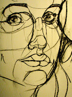
Faces. I have come to the conclusion that drawing other people's faces are much easier than drawing my own. I think I need to draw my mug at least 50 more times tonight before I might get one that I will accept as my final portrait.
I love drawing lips, they're so luscious. Well, female lips are luscious. Older people have thinner lips, and men often have duller shaped lips than females. The "love filter" is probably my favorite landmark of the face. It is a drastic dip that constructs the curve at the top of the lips. Some people have shallow dips that just make round lips, and others with deep dips angle for pointed tops.
Eyes & Noses

Eyes and noses are what people find to show the most emotion from a human. They look to the eyes to see how to interact, and what mood they feel. I find eyes much easier than noses to draw. Eyes have basic guidelines that are similar from one person to the next.
A sphere for the eyeball itself, than simple curves and tear ducks.
Where as noses are the ruler of the face. They measure out how big other things on the face will be, how long the face is, and the placement of other structures.
Noses have several different architectural points (bridge, glabella, bulb) that are visible on most noses, but they are all SO different. My nose is long and skinny, where as the person next to me has a wide flat nose.
I suppose with so many choices, that is why rhinoplasty is so popular.
Skulls

Skulls are the cherry on the sundae. However, when drawing, they are at times not nearly as sweet. Skulls seem to be a spherical shape. A round shape that is smooth. However, there are bumps and curves from the different parts of the skull. The frontal bone is rounded but met by the medial line that separates the two halves of parietal bones.
Baby skulls have soft spots because when coming out of the womb they are not fused together. However, as they grow older the different sections come together to form the hard shell that protects the brain.
The skull also forms the facial structures for each individual-but that may come in the next blog.
Sunday, April 25, 2010
Hands
This is a laugh, but I was digging up old pictures from elementary school and even middle school that I had drawn. From the start I have been curious about the human figure and trying to draw it accurately. I believe Leonardo DiCaprio drawing Kate Winslet in Titanic started it all but that's not the point. For the longest time I noticed, I drew figures with their arms twisted around to their backs. Although it gave many of the images innocent poses, the main reason is because I was very weak at drawing hands.
Hands are tough to get down, even now I tend to save illustrating hand gestures until the very last moment. However, when doing them as gestures, I use to make them into crescent shapes and was pleased, but now I base them off of the muscles that build them. I feel like they are much more lively and have a sense of motion to them. It's very exciting, and now I like placing hands in visible places. It's great.

Tuesday, April 20, 2010
Posture

Going into the muscles of the upper thorasic area and the pectoral region, I see how much the muscles are allowed to stretch and pull when a person sits up straight or slouches. It makes me wonder how we can possibly train ourselves to sit up straight, is it really beneficial in the end to have better posture? I believe it feels better, however when the body feels sluggish, not holding rigid poses seem to feel more comfortable. When models sit or lay in long poses, their bodies seem tense in some parts, especially joints. I find myself making darker lines to get the feeling of tension and discomfort.
The human body can be physically strong, however, can be equally weak when it comes to the smallest inflictions. Including poor posture and uncomfortable settlements.
Subscribe to:
Posts (Atom)

